Jordan Calloway
Senior UI/UX Designer — Systems, Craft, and Measurable Impact
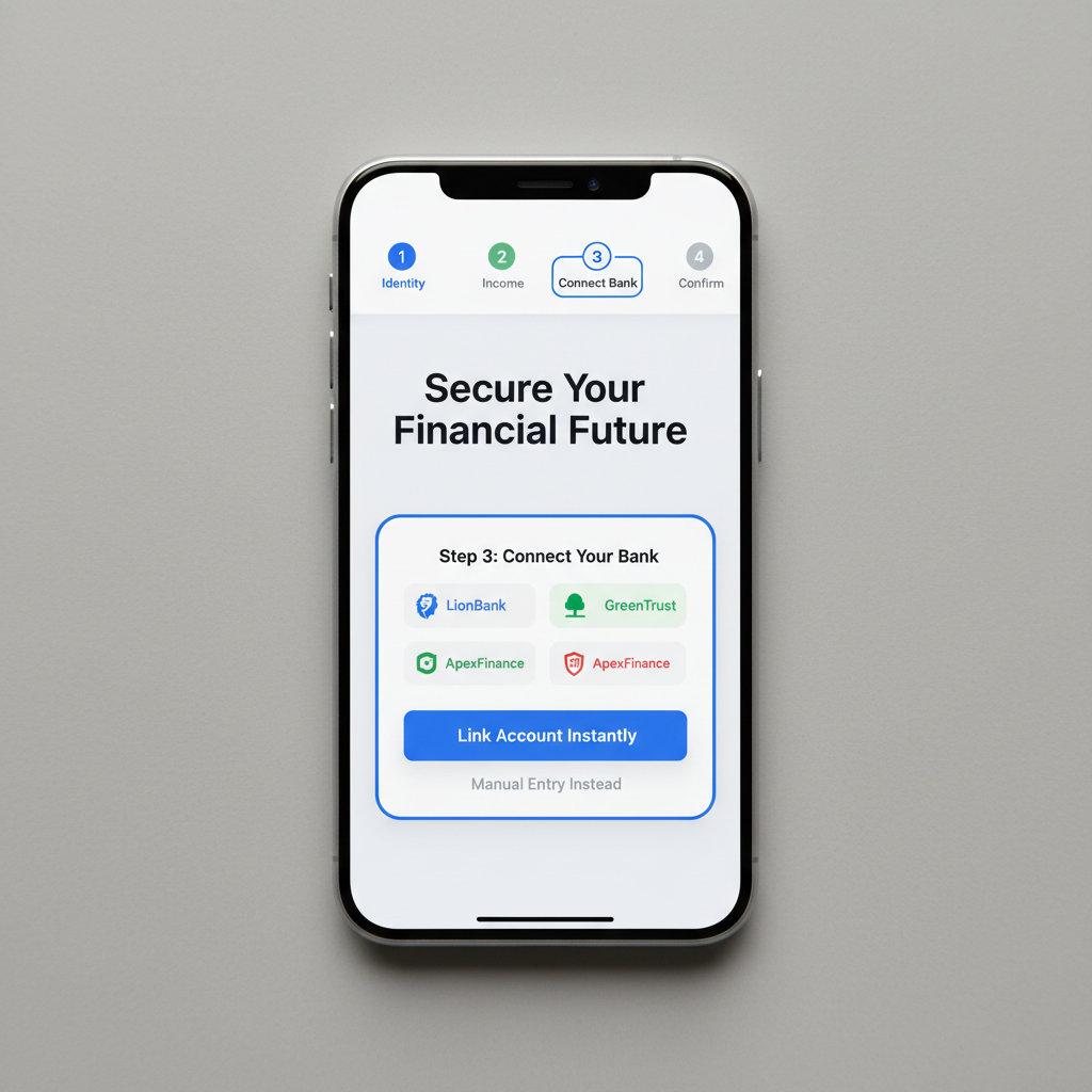
Fintech onboarding that lost 68% of users before the first transaction.
A Series B neobank hired me six weeks before launch. Their onboarding had been built by engineers following a compliance checklist. The result: a 14-step flow, three identity verification dead ends, and a drop-off cliff at step four.
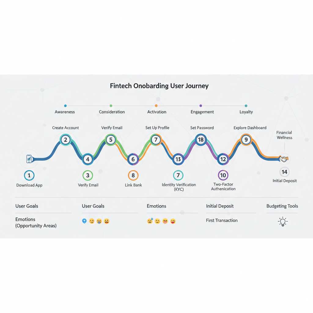
User Journey Map
14 touchpoints audited

Competitive Audit
8 products benchmarked
Usability Sessions
22 participants, 3 rounds
−61%
Drop-off rate
4→3
Steps to first tx
4.8★
App store rating
Twelve product teams. Zero shared vocabulary.
A 300-person SaaS company had grown by acquisition. Three separate design teams, four codebases, and a brand that looked different on every surface. The brief: build one design system to unify all of it — without stopping the product roadmap.
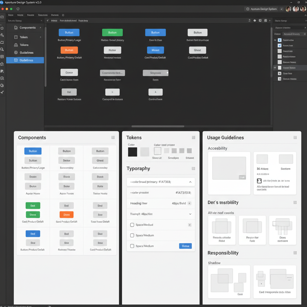
Color Tokens
128 tokensSemantic, theme-ready, WCAG AA throughout
Typography Scale
18 stylesFluid type with optical sizing baked in
Component Library
240+ componentsFigma + code parity, documented exhaustively
Motion Spec
32 easing curvesPhysics-grounded, reduced-motion aware
Icon System
620 iconsDual weight, 4px grid, SVG-optimized
Spacing Grid
4pt base unitConsistent density across all surfaces
−40%
Design-to-dev handoff time
3→1
Design systems consolidated
94%
Adoption across product teams
×2.3
Feature velocity, Q1→Q2
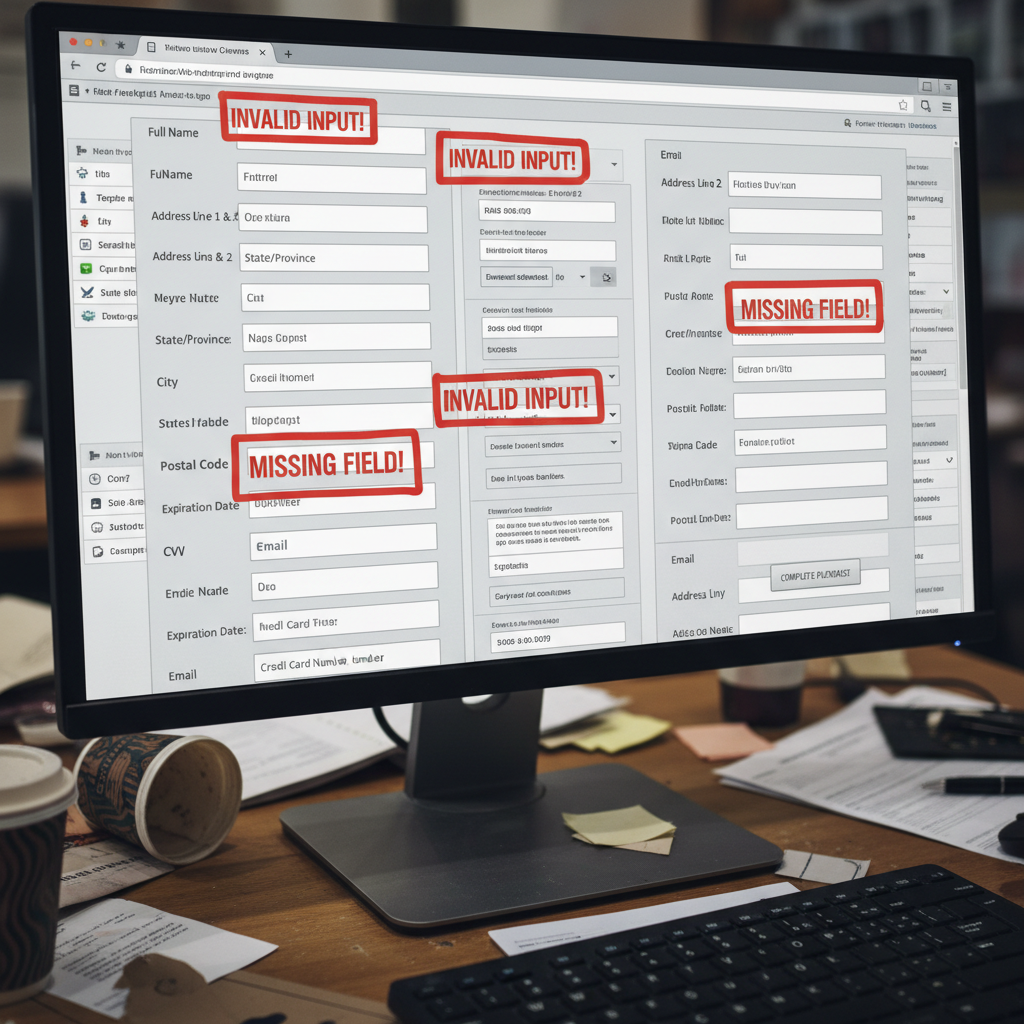
The checkout that cost $2.4M in annual GMV.
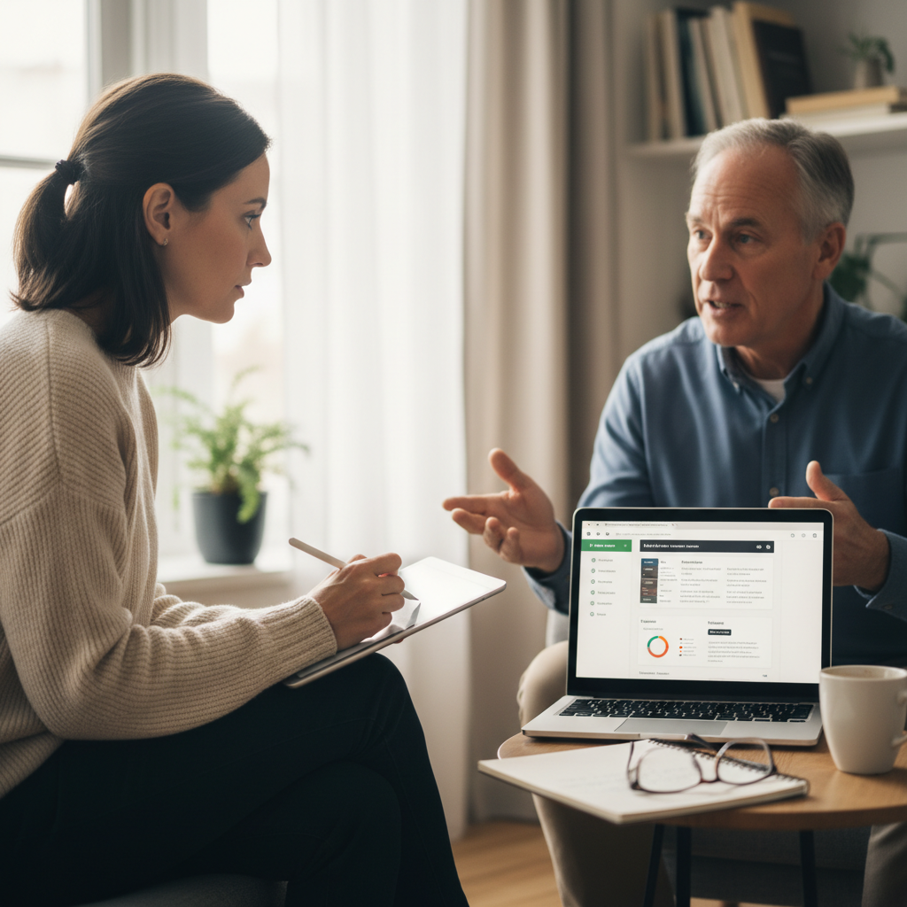
A consumer marketplace's checkout had a 71% abandonment rate. The engineering team had already A/B tested button colors and copy. What they hadn't done: watch a single user try to check out. I spent two days in sessions. The problem was cognitive, not visual.
Six-month post-launch results
−58%
Checkout abandonment
vs. 71% baseline
+$3.1M
Recovered GMV
annualized projection
2.7×
Mobile conversion
vs. prior quarter
4.9★
Checkout NPS
from 2.1 pre-redesign
There are nine more projects.
Early access sees them first.
The full case studies
launch soon.
Full case studies launching soon — early list sees them first.